
Unveiling and decoding our new brand identity


OJTA was founded in 2017 by OPAL Environmental Justice to help build a powerful statewide movement for a Just Transition. Our purpose was to build a shared analysis about the ecological crises we face, strengthen relationships, and share strategies of success. In August of 2020, the work of OJTA became so vibrant and large that it spun off from OPAL into an independent statewide alliance. After four years of independence, we’re celebrating with a new logo! By sharing its symbology and meaning, we aim to inspire shared leadership and amplify our collective impact in advocating for racial, economic, and climate justice.
A group effort
In the summer of 2023, our team made the decision to rebrand. We did this because we wanted to renew our commitment to an abundance mindset, and a long-term vision of a Just Transition. With the help of After Bruce communications agency, we spent weeks laying out our goals and aspirations, so they could render our complex ideas into one cohesive brand that represents us, the Oregon communities that we exist in, our members, partners, and base.
During these important conversations, we spoke about the power of frontline voices and ancestral wisdom. About joy and the power of hope. About our roots in civil rights and environmental justice. “This is not just an alliance, it’s a movement,” said Executive Director Joel Iboa during one of our brainstorming sessions.
In the spirit of our movement for a Just Transition, we solicited feedback from communications professionals who work at our member organizations. We distilled our message: We are frontline communities organizing for racial, economic, and climate justice and a just transition to a regenerative economy. We fight for people-first climate policy and implementation, prioritizing people of color, low-income, rural, and disabled folks.
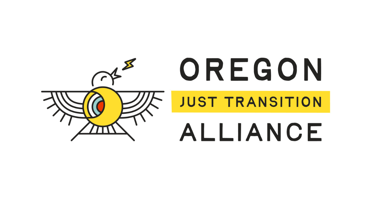
What does the logo represent?
Our new logo is inspired by Oregon’s state bird, the Western Meadowlark. It is seen with its wings proudly spread open, in a joyful expression of song. One its memorable features is its striking yellow breast. The ruffled feathers and lightning bolt bring a sense of power, energy and urgency, contrasting the pure joy which is so central to sustaining our movement.
To reflect an element of hope, the tail of the bird mimics a horizon and the future. The crescent shape is a nod to the sun and moon, remembering the ancestral wisdom that is grounded in a reciprocal relationship with nature.
Our movement is interdependent on people and places in Oregon and abroad. We captured this quality with interwoven lines that represent connection and community, as well as concentric circles at the heart of the bird represent the many rings of leadership. We see it as solidarity rippling out from local to international, transcending boundaries and borders.
To represent being in right relationship with the people and cultures that make up our movement, the color palette takes inspiration from the Ojibwe Medicine Wheel. In it, black, white, yellow and red represent a different direction, season, element, stage of life and sacred medicine. The fifth color blue represents balance and life-giving water. Finally, the vibrant red at the core is inspired by the heart that our members and frontline community members bring to the work to fuel the movement forward.
On the horizon
The unveiling of our new brand marks a significant milestone in the evolution of Oregon Just Transition Alliance. It represents not only a visual transformation but also a deeper commitment to our values and mission. As we embrace this fresh identity, we’re fired up and ready to advocate for racial, economic, and climate justice. We invite you to join us on this journey for a more united and stronger Oregon.